0
URBEN GIFTS & GADGETS
THE ULTIMATE SHOPPING EXPERIENCE
THE RUN DOWN
Urben is a creative, modern and certainly unexpected gift shop in the heart of South Miami, Florida focused on providing an exciting experience. The gift shop was concepted with by a skilled and driven couple with a grand trendy vision.
Quiet confidence, a modern industrial look, was the way to go. Emphasis was placed on the logotype system to convey refinement with approachability, store and gifts photography to entice the senses of the shop, and social media communications to elevate core values and trendy gadgets that Urben will be providing as a perfect gift for others.
SERVICES PROVIDED
BRANDING
_ Naming
_ Logo Dev
_ Brand Identity
_ Brand Voice
DIGITAL
_ Social Media
WEB
_ UX/UI Design
_ SEO
_ Website Dev


Following the concept of “trendy,” we focused on viewing the name as an old-school sign with a modern twist.
MAKING IT REAL
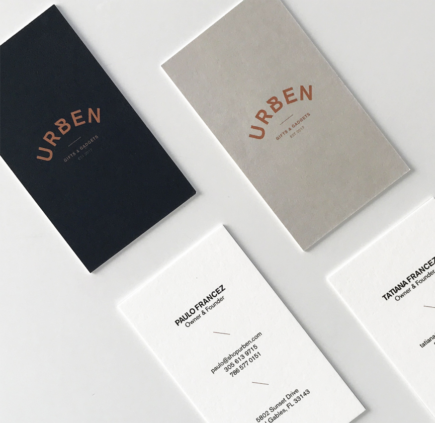
The Brand Collective designed for Urben a comprehensive brand experience that is clean, modern, trendy, approachable and authentic. By creating a mood board and creating a story around Urben values and mission we set the tone of their entire branding. The brand took a rail of a modern industrial look that fits their gadgets and gifts perfectly. Wordmark, visual identity, photography and other brand elements add personality, texture and urban feel.


THE BRANDING
Urben’s name was inspired by a modern take on the idea of an urban city-dwelling dreamer and their desires for extraordinary things. The logotype approach emerged from the concept of industrial style with a modern twist experience. Both the thick and thin sans serif type were influenced by the look we were looking for the brand. Urben not only create an endless style but also tie-in with the colors, environmental design, and elements of collateral and packaging to create all at once.


The dual logotype is beautiful marriage of different weight of the same font styles creating depth. This helps us choose two fonts that blended and worked together with the brand print collateral and web visuals.

BRAND SPLASH PAGE
Ultimately we created a single page template but made sure it worked for the coming soon countdown and afterward store page, not only to create ease in design and development, but also to create consistency across both ideas. Urben is a particularly successful example of spending time in wireframe so that the design phase is informed and efficient even if it is for just for a single page.
