0

#NotMe
JOIN THE MOVEMENT. MAKE IT SAFE.
THE RUNDOWN
Leading a strong stance in the current fight against injustice in the workplace, #NotMe offers a supportive and safe space for individuals to speak up and report workplace misconduct while seeking resolution. Harassment claims are easily and anonymously made through #NotMe’s app platform so that no individual in the workplace has to feel silenced or unsafe again. We teamed up with the revolutionary platform to deliver a bold visual identity and web presence that aligns with its mission.
SERVICES PROVIDED
BRANDING
_ Visual Identity
_ Iconography & Illustrations
_ Imagery Sourcing
DIGITAL
_ UX/UI Design

THE RUN DOWN
Leading a strong stance in the current fight against injustice in the workplace, #NotMe offers a supportive and safe space for individuals to speak up and report misconduct while seeking resolution. Harassment claims are easily and anonymously made through #NotMe’s app platform so that no individual in the workplace has to feel silenced or unsafe again. We teamed up with the revolutionary platform to deliver a bold visual identity and web presence that aligns with its mission.
SERVICES PROVIDED
BRANDING
_ Visual Identity
_ Iconography & Illustrations
_ Imagery Sourcing
DIGITAL
_ UX/UI Design


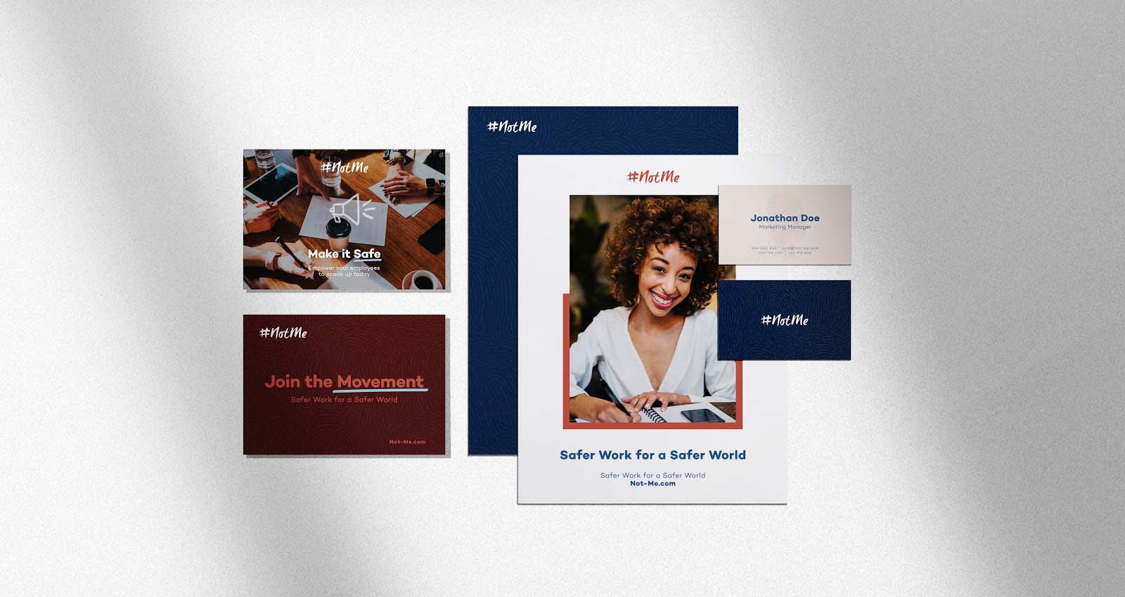
Visual Identity
Working to find the balance between inviting design and strong messaging, our branding team sought to create a visual representation of the brand that would work to humanize the platform and make it feel less like a sterile tech brand. While the technological aspect of the platform was definitely something we wanted to highlight, we worked to capture the emotion behind the mission, as well as the humanity behind what the brand represents. The design allows for a more elevated aesthetic while still reflecting bold colors to reinforce the image of “change-making”.
Selecting the right imagery to compliment the visual identity design was also key in developing the look of the brand. Without imagery the brand identity felt cold and incomplete. Our team wanted to bring in the missing human element while still showcasing a professional, but personable, image of a safe workplace.
Iconography
Our team created hand drawn icons to illustrate how the platform works as well as represent each of the values of the brand. Creating these as hand drawn elements works as a continuation in reinforcing the human element, rather than having it appear geometric and generic. These handwritten elements compliment the branding while give a visual representation of reworking an antiquated work structure. Elements like circles and check marks not only give the brand some personality, but also illustrate the idea of unsafe office culture evolving into a safe space to report workplace misconduct.

Website Development
Our web team worked to design #NotMe’s website with user experience at the forefront. While incorporating the new branding in the website’s new design, we wanted to keep messaging clear and not draw away from the site’s sole purpose of informing and operating as a platform for individuals to anonymously report workplace misconduct. The finished product resulted in a clean design where all elements of the visual identity came alive in a very functional layout that is informative and most importantly user-friendly.


